GRAINnS
- Brand Identity/Logo
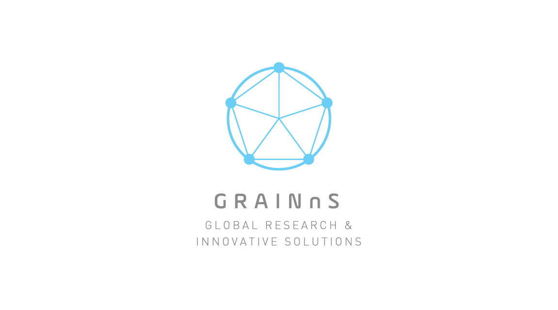
GRAINnS is a semiconductor consulting company based in Japan and China. They provide innovative solutions to issues within the semiconductor industry through research conducted from a global perspective. Their five main areas of focus are: Nano-semiconductor solutions, manufacturing technology solutions, patent technology solutions, mutually beneficial global partnership building, and brain-computer interface solutions.
When developing the logo, I wanted to create a mark that would symbolize their focuses and values. I began with the concept of symbolizing their five main focuses and utilizing shapes commonly found around semiconductors (lines and dots).
The five focuses are represented by the five dots which are connected through inner and outer lines. This relays the idea of unity and interconnectedness within a diverse collective. This shape is then encircled with a thicker line to symbolize inclusion through a shared global perspective.
- ServiceBrand Identity Logo Design Stationery