Taste of Paradise
- Brand Identity/Logo
Taste of Paradise gathers a lineup of chefs and mixologists from restaurants and eateries around the island to showcase their favorite dishes and drinks. Catered to all the foodies, this FOODIE festival was created as an inclusive alternative to many of the pricier food festivals, without compromise in quality of dishes and vendors.
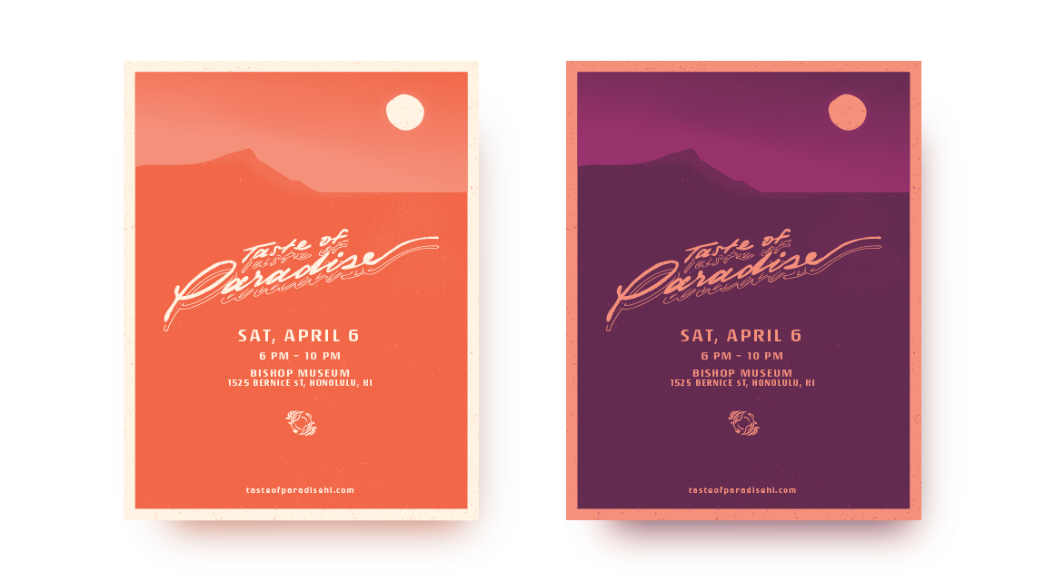
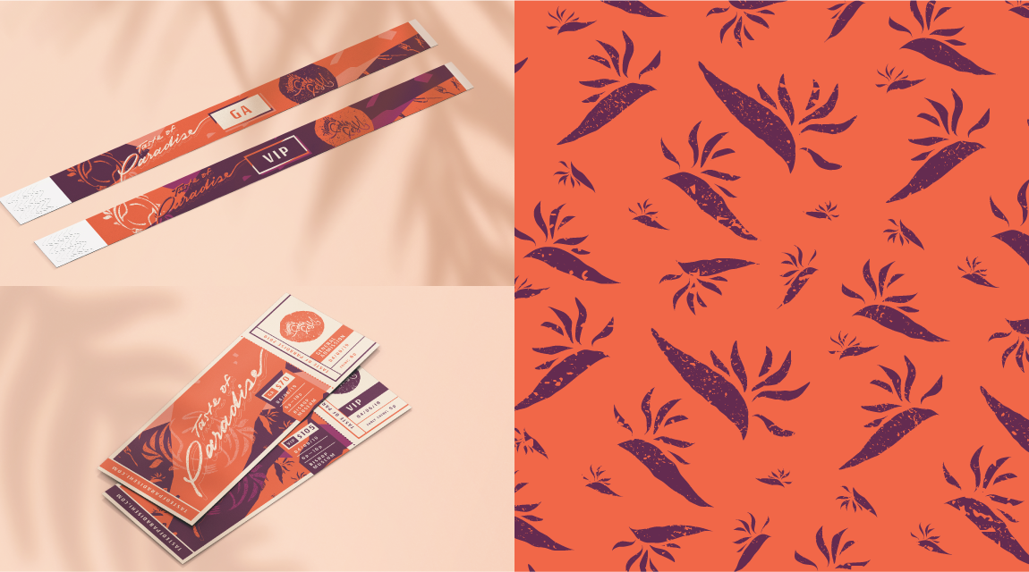
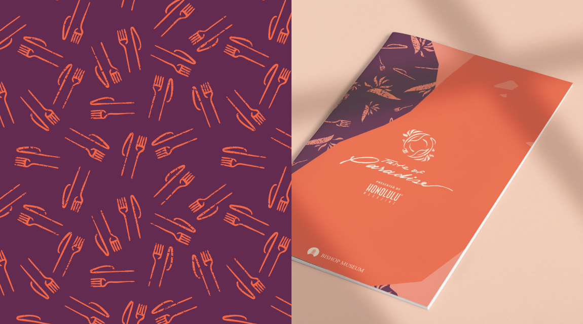
I was asked to do the visual brand identity as well as all other print and digital brand and promotional collateral design. As a food festival aimed at younger adults who were seeking a similar experience to the pricier festivals, the branding had to reflect youthfulness while simultaneously maintaining a sense of sophistication.
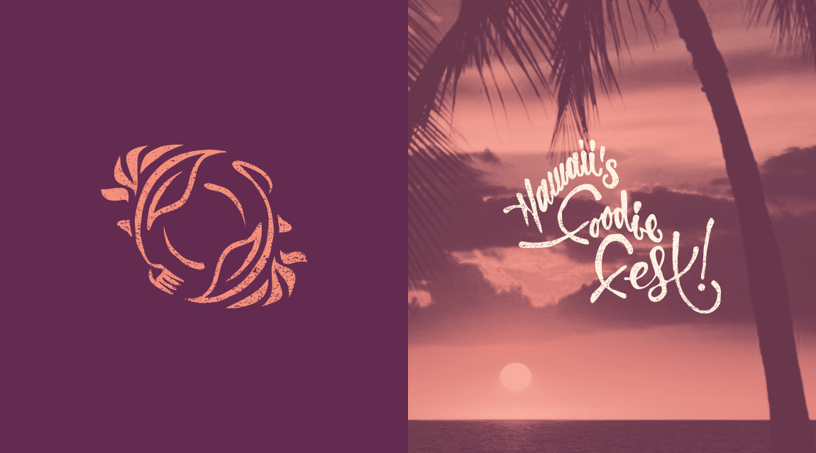
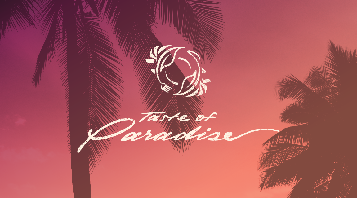
The creators of the event wanted to incorporate a Strelitzia (or bird of paradise flower) into the logo. The logomark consists of two Strelitzia with the ends of each plant taking the shape of a fork and knife, converging to form a plate. The wordmark is a handwritten script to convey the casual, yet, classy atmosphere of the event.
As a food festival in Hawaii, Hawaiian cuisine is naturally going to be showcased. To convey the significance of Hawaii, the design elements of the brand are styled to mimic a stamp-like effect, inspired by the aesthetic of traditional Hawaiian ‘ohe kāpala (bamboo stamp).
For the brand's color palette, I wanted to choose a pairing of colors that had enough "pop" but also subdued enough to appeal to the specific demographic of young adults the event was targeting. The colors purple and orange were chosen to represent both the colors of the Strelitzia as well as the Hawaiian sunset.
- ServiceBrand Identity Logo Design Branding/Marketing Collateral Signage